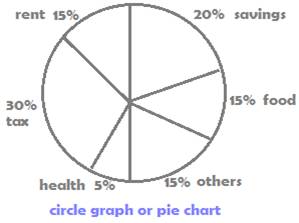
Circle Graphs/Pie Charts
A circle graph, also called pie chart, is another form of data presentation.
A few points of Data interpretation of the above circle graph:
- The circle is divided into six segments
- Each segment denotes a division of a family’s monthly income
- Percent values represent each division’s share of the total income
- Larger segments denotes greater income share
A deeper data interpretation of the above circle graph is carried out in the following questions:
For all of the questions below related to the above circle graph, assume the total monthly family income to be 50,000 rupees.
1. What percent is paid for tax?
Answer:
In the above circle graph, the tax share is 15%.
So, 15% of 50 000 = (15/100) × 50 000 = 7500
2. What percent is maximum data greater than the minimum data?
Answer:
From the above circle graph,
Tax is the maximum data at 30% and Health is minimum at 5%.
Since both tax and health are expressed out of a same total, the exact numbers that their individual shares are, will not be required.
Therefore, perform the required calculations directly on the percents given in the circle graph as below
30% is what % greater than 5%
Percent More = (difference/smaller) × 100%
i.e. (30 – 5)/5 × 100 % =
(25/5) × 100% = 500%
3. What percent is savings less than tax?
Answer:
As in q.no. 2 solve using percent values, without finding the exact individual values.
In the circle graph above, the data for
Savings is 20% and tax is 30%.
Use the following formula for percent less
Percent less = (difference/greater) × 100%
i.e. (10/30) × 100% = (1/3) × 100% = 33.33%


